For the last 500 years, a certain kind of world map has been used to teach children about our planet. But forget everything you know. The world is not as it seems, humanity has been brainwashed by a Flemish mapmaker, and we’re (probably) living in a colonial Matrix. I hope you’re sitting down. That world map is wrong.
Most might recognize the old world map from faded school textbooks. It’s called the Mercator projection. In 1569, Gerardus Mercator built a whole world drawn along colonial lines — literally. Every straight squiggle between continents depicts a shipping route for trade, with the biggest economic powers given the space on paper to flex their border biceps.
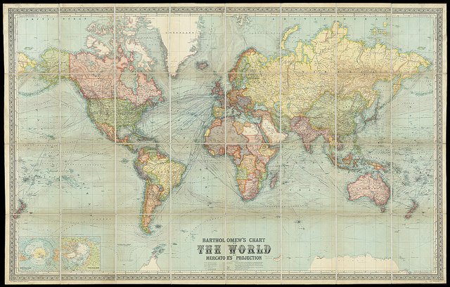
The problem? It’s nowhere near to scale. Europe is not the center of the universe — Mercator just moved the equator. North America is nowhere near that big — although it might feel that way if you watch the news. In reality, South America should be twice the size of Europe. Greenland should be 14 times smaller than Africa and three times smaller than Australia, whilst Alaska appears three times larger than its actual big sibling, Mexico.
The Mercator projection vastly exaggerates aged imperialist power, at the expense of developing countries and continents like Africa that are shrunk to inferiority. There’s a reason why the Northern Hemisphere is associated with wealth and significance — it’s because it’s literally on top, permanently etched into our subconsciousness as superior from our earliest encounters with learning.
But there is another map. A map that laughs in the face of the old world order, that is scaled without topographical bias, that actually tries to tell the truth. Say hello to our survey saviour: the Gall-Peters projection.
Discovering the Western-centric distorted perception of countries & continents by looking at the Gall-Peters Projection. pic.twitter.com/mhHZZ1qYrK
— Evelyne Auer (@EvelyneAuer) March 21, 2017
More commonly known as the Peters projection, it was published in 1974 by Dr. Arno Peters. It’s an “equal-area” map, borrowed from the work of 19th century Scotsman James Gall, which means it accurately scales land according to surface area, creating a far more balanced reflection of what the world really looks like. It’s totally free of colonial bias.
And public schools in Boston have made a big change — all new maps will be Peters projection. According to Colin Rose, assistant superintendent of opportunity and achievement gaps for Boston public schools, it’s “the start of a three-year effort to decolonize the curriculum in our public schools,” to draw away from the cultural whitewashing of history in places of education.
Read More: What’s in a Map? Facts, Half Truths, and Outright Lies
"Eighty-six percent of our students are students of color," said Hayden Frederick-Clarke, director of cultural proficiency for Boston Public Schools, in an interview with WBUR. “Once students feel like the school isn't being truthful, there's a tendency to shut down and reject information.”
No map is perfect — a two-dimensional reflection of a spherical world will always be flawed. Even the derivation of the world implies vulnerability; it comes from the Latin “mappa”, meaning “napkin”, to describe the surfaces first used to draw them. The Peters projection is not without its blemishes either — it looks like it's got post-diet stretch marks, since there’s just not enough land to effectively translate onto a flat map.
If you’re still not entirely sure what on earth we’re talking about, let The West Wing explain.
“In our society we unconsciously equate size with importance, and even power,” says The West Wing’s Notepad Man. Another official adds: “when third world countries are misrepresented, they’re likely to be valued less.”
Basically, it’s like Toblerone. If you make something look smaller, everybody will think it’s worth less. If you shrink (admittedly brilliant) chocolate, people lose their minds. It’s an “apocalyptic wasteland”, it’s “dreadful”, it’s the biggest talking point on the internet. But when it’s a continent you might never visit, it’s relegated to the dregs of forgotten dialogue that nobody wants to talk about, thrashing limply with the final season of Scrubs and the American reboot of The Inbetweeners.
The presentation about the Peters Projection Map on the West Wing is the greatest thing ever
— Amy (@amywhoisawesome) February 5, 2017
But the problem extends way beyond the classroom. Incredibly, even Google Maps is stuck on the Mercator projection. When the internet has inherited internal bias, a bad idea can spread like an epidemic. The whispered notion that the West is somehow bigger and better than the rest of the world persists, subtly, sneakily, until suddenly world leaders can transform the invisible precedent into rhetoric that swivels between patriotism and nationalism in reckless lurches.
Every journey starts with a map. But if you set off on the wrong foot, misdirection can become misadventure. It’s easy to get lost. The hard part is making sure nobody else follows in your footsteps.